Optimizing images for your website is important. The right image sizes can significantly impact your site’s performance, user experience, and search engine rankings. In this ultimate guide, we will explore and explore the perfect image sizes for websites. It will help you strike the perfect balance between quality and efficiency.
![Perfect Image Sizes for Websites: The Ultimate Guide [2025] 1 perfect image sizes for WordPress](https://storeseo.com/wp-content/uploads/2024/08/StoreSEO-Perfect-Image-Sizes-for-Websites_-The-Ultimate-Guide-2024.jpg)
The Importance of Perfect Image Sizes For Websites
Images are a crucial part of any website, providing visual appeal and engaging users. However, the size of these images significantly impacts the website’s performance. Large images can slow down loading times, leading to a poor user experience.
Larger images take more time to load because they contain more data. This can frustrate users who expect fast-loading pages, especially in today’s fast-paced digital world. Slow loading times can lead to higher bounce rates, where users leave the site before it fully loads, negatively impacting user engagement and overall site performance.
Another important factor to consider is that fast-loading images can enhance user engagement by providing a seamless browsing experience. Users are more likely to stay on a website that loads quickly and smoothly. This is particularly important for e-Commerce sites where high-quality images are essential for showcasing products. But must be balanced with quick load times to keep potential customers engaged.
The Role of Perfect Image Sizes for Websites In SEO
![Perfect Image Sizes for Websites: The Ultimate Guide [2025] 2 Perfect Image Sizes for Websites](https://storeseo.com/wp-content/uploads/2024/07/image-12.png)
Optimizing images by reducing their file size without compromising quality can significantly improve page load speeds, which is crucial for better search engine rankings. Faster-loading pages are favored by search engines, leading to higher rankings in search results. Optimized images help reduce bounce rates by ensuring that pages load quickly, encouraging users to stay longer and explore more content.
This enhanced user experience is vital for SEO, as it can lead to longer visit durations and higher engagement metrics, both of which are positive signals to search engines. With the increasing use of mobile devices, optimizing images for mobile performance is essential. Smaller, optimized images load faster on mobile networks, improving the mobile user experience and boosting mobile search rankings.
Ensure Images Look Great on All Devices
Ensuring that images look great on all devices, from desktops to mobile phones, involves using responsive images. Responsive images adapt to different screen sizes and resolutions, providing an optimal viewing experience. Here are some best practices for achieving this:
- Use HTML Attributes: Utilize HTML attributes like ‘srcset’ that allow you to specify a list of different image sizes and resolutions for the browser to choose from depending on the user’s device capabilities and viewport size. This enables serving optimized images to improve page load speed and performance.
- CSS Techniques: Use CSS to set the width of images as a percentage of their parent container rather than fixed pixel values. This ensures that images scale proportionally with the screen size, maintaining their aspect ratio and clarity.
- Media Queries: Implement media queries in CSS to serve different images or adjust image styles based on the device’s screen size. This helps in providing the best possible image quality and performance for each device.
- Optimize Image Formats: Choose the right image formats for different types of images. For example, JPEG can be used for photographs, PNG can be used for images with transparency, and WebP can be used for better compression and quality. This ensures that images are both high-quality and optimized for fast loading.
- Lazy Loading: Implement lazy loading to delay the loading of images until they are about to appear in the viewport. This improves initial page load times and overall performance, especially for image-heavy websites.
Optimizing Image File Sizes For Shopify
You can optimize your Shopify store images using StoreSEO very easily in a few simple steps. Here is the breakdown of the steps:
Step 1: Set Up Default Image Optimizer Settings
StoreSEO’s image optimizer lets you set default image optimization settings. To do this, go to the ‘Settings’ tab on your StoreSEO dashboard. Then, click on ‘Image Optimizer’ to find all the options you need.
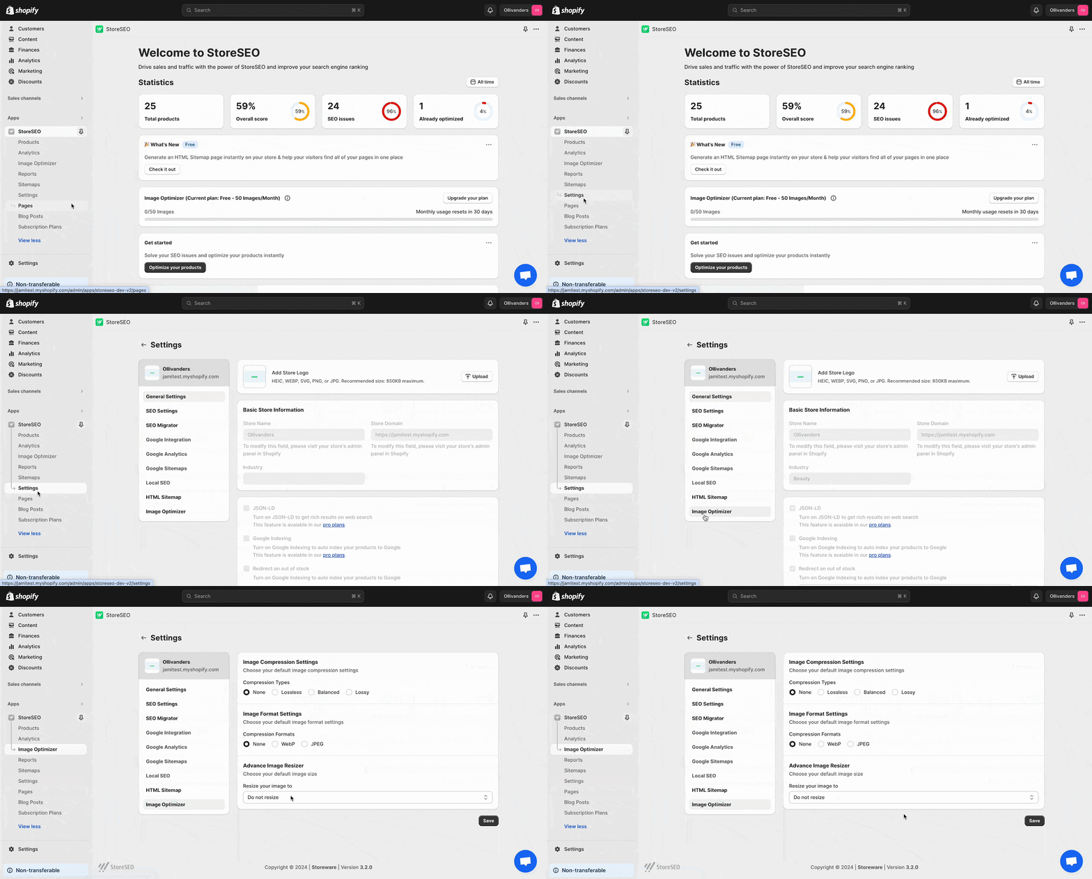
Set your preferred options for Image Compression, Image Format, and Image Resizer. Then, click ‘Save’.
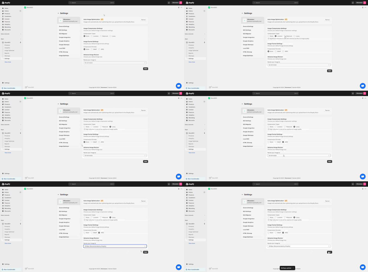
Step 2: Navigation To The ‘Image Optimizer’ Tab
Go to the StoreSEO dashboard and click on the ‘Image Optimizer’ tab. Find the image you want to optimize and click the ‘Optimize’ button. Your image will be optimized right away using your default settings.
![How To Use StoreSEO Image Optimizer On Shopify 3 Perfect Image Sizes for Websites: The Ultimate Guide [2025]](https://storeseo.com/wp-content/uploads/2024/07/image-15-1024x504.gif)
Here, to compare the changes, click on the ‘Compare‘ button. If you want to reoptimize the image, adjust the settings as you need and hit the ‘Re-optimize’ button.
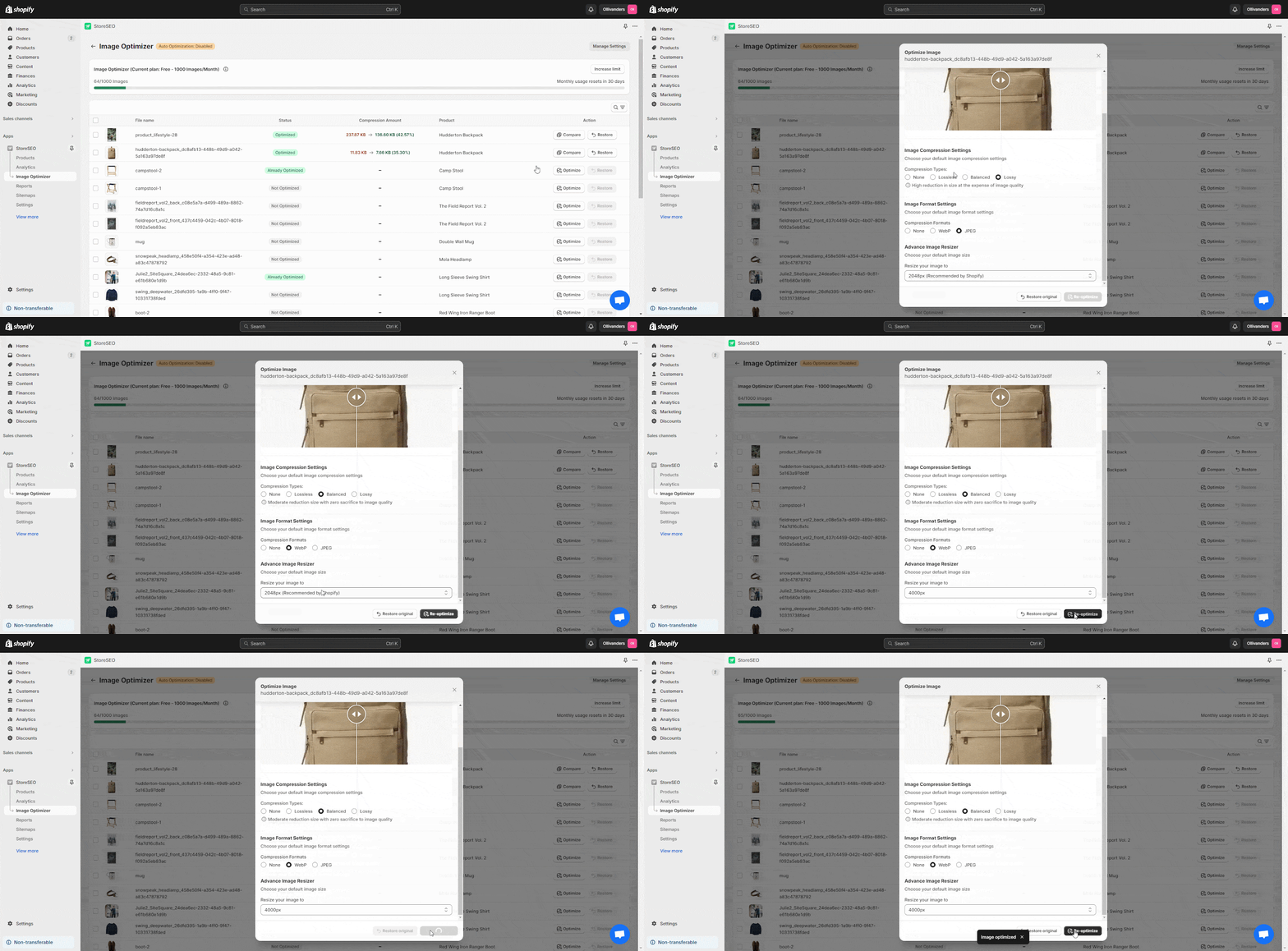
Now, if you want to revert the image optimization, just click the ‘Restore’ button. It will instantly change back to the original image.
![How To Use StoreSEO Image Optimizer On Shopify 13 Perfect Image Sizes for Websites: The Ultimate Guide [2025]](https://storeseo.com/wp-content/uploads/2024/07/image-17-1024x551.gif)
Step 3: Enable Auto Image Optimization
From the ‘Image Optimizer’ in the sidebar click on the ‘Manage Settings’ button. A default settings tab with the ‘Auto Image Optimization’ option will appear.
![Perfect Image Sizes for Websites: The Ultimate Guide [2025] 3 Perfect Image Sizes for Websites](https://storeseo.com/wp-content/uploads/2024/07/unnamed-1.gif)
Now, click on the ‘Turn on’ button from the ‘Auto Image Optimization’ section. This will instantly enable auto image optimization for your Shopify store. To learn more, follow this documentation.
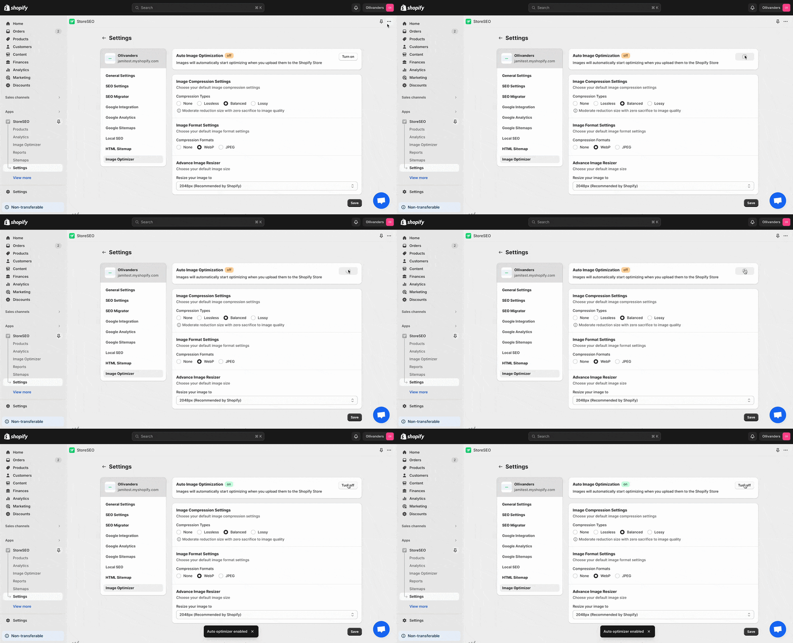
This is how easily you can use StoreSEO Image Optimizer on your Shopify store.
Image File Formats For Websites
Choosing the right file format is as important as perfect Image sizes for websites, for optimizing image quality and file size. Here are some of the best formats for different types of images:
- JPEG: Ideal for photographs and images with many colors. It uses lossy compression, which can significantly reduce file size while maintaining acceptable quality. JPEG is not suitable for images with transparency.
- PNG: Best for images that require transparency or have text, logos, or graphics with sharp edges. PNG uses lossless compression, preserving image quality but resulting in larger file sizes than JPEG.
- SVG: Perfect for vector graphics such as logos, icons, and illustrations. SVG files are scalable without losing quality and typically have smaller file sizes than raster images. They are ideal for web use as they remain crisp at any resolution.
Implement Image Compression & Other Sizes for Websites
Perfect Image sizes for websites like Shopify, WordPress, and custom websites involve adhering to specific guidelines to ensure optimal performance and visual appeal. On Shopify, product images should be at least 800 x 800 pixels, with a recommended size of 2048 x 2048 pixels, and compressed using tools like StoreSEO.
WordPress requires various sizes for different uses, such as 1920 x 1080 pixels for background images and 150 x 150 pixels for thumbnails, with plugins like Smush aiding in optimization. Custom websites necessitate analyzing the layout, using browser tools to inspect dimensions, and following developer documentation to maintain correct aspect ratios and file formats.
Hope this guide helps you choose the perfect sized image and optimize it for your stores and websites effectively. If you find this blog helpful, then do not forget to subscribe to our blog to read more blogs, tutorials, tips, and tricks.


